Subscribe to our newsletter!
We don't spam. You will only receive relevant and important tips for you and your business.
Unsubscribe anytime.
Having a bad website doesn't just look unprofessional – it can actually hurt your brand and business more than you might realize. Imagine this: potential customers visit your site, but it's confusing, slow, and hard to navigate. What happens? They get frustrated and might leave without buying anything. That's potential sales down the drain.
But it goes even further. A poorly designed website can give people a negative impression of your whole brand. It's like showing up to a meeting in your pajamas – not the image you want to project, right?
So, let's break it down. Some common website mistakes can really mess things up for your business. But here's the silver lining – you can fix them.

Various factors can contribute to a bad user experience (UX), many of which we will cover in this article. A bad UX can result in a loss of conversions and ultimately hurt your business.
Each page of your site should have a clear intention. If your goal is to, say, offer digital services to potential clients, then you’ll want to make sure you direct users through your site in the correct order.
Not offering users the information they are looking for leads to a bad UX. Today, it is easier than ever for consumers to get what they want when they want it. Your site needs to deliver the information the user is looking for at the moment they get to your page. If not, they can go to another site within a second.
Your site does a lot for your business’s credibility, so your first priority should be to communicate that you know what you’re talking about.
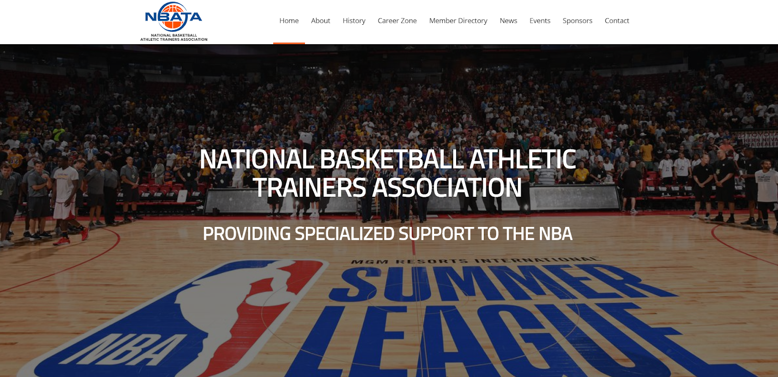
Here is an example of a website that we designed for the National Basketball Athletic Trainer’s Association.

Websites should be simple, include visuals, provide useful content, and have a call-to-action (CTA).
Keep in mind that you get what you pay for when it comes to website design. Low costs will yield poor results. An investment in a good site will go a long way and building a custom website will take your business to a new level.
Even if your outdated content is performing well, you should always keep the user in mind. The content on your site should be relevant and useful. Outdated content can drag down the authority of your site and negatively affect your SEO.
Google favors quality content that is useful to the user. When content marketing first came onto the scene, everyone was writing as many articles as they could, because it was believed that the more posts you had - the better you would rank. Now, Google is filtering out bad content marketing because most of it isn’t beneficial to readers. If the content on your site isn’t useful, it won’t be delivered to users.
To determine if your content is performing, you can complete a content audit.
There are a few steps to this process. First, you will need to assess the quality of each of your content pieces.
Google defines quality content as:
After evaluating your content according to these standards, you can decide whether your underperforming content needs to be updated or removed.
You can leverage the value of old content by updating it. Repurposing content can help to improve your visibility, traffic & SEO. And, it can increase your rank on Google.
To update your old content, you can:
- Fix past grammar mistakes.
- Improve the content’s accuracy. Depending on how long ago the content was written, some information may be out-of-date or incorrect. You can update this information so that the post is relevant.
- Remove broken links & add better links. Adding better links will, in turn, increase your site’s authority and improve SEO.
- Add multimedia. Adding photos and videos can also help to break up your content and make it easier to read- resulting in a better user experience.
- Optimize for new keywords. Depending on when you last edited the content, you may need to optimize for different keywords. Or, if keywords weren’t on your radar when you first wrote the piece, you may need to edit it so that you do include important keywords.
Updating old content will also help to improve your click-through rate (CTR). People are more inclined to click on articles that were most recently published. Especially when reading about ever-changing topics, like SEO, healthcare, or technology. Updating your content will give it a recent publishing date, therefore making users more likely to click through to your site.
If you find that you have content that isn’t relevant to your readers, isn’t performing well, and has no backlinks, then you should remove it.
Spelling mistakes can negatively impact the credibility of your site. Global Lingo found that 59% of people would not trust a company that had obvious grammar mistakes on its website or marketing material. According to Matt Cutts, good spelling and grammar are correlated with higher-ranking websites.
Here are a few tools we suggest to help you catch those occasional slip-ups:
Grammarly is an AI-powered writing assistant that corrects mistakes in real-time. Grammarly not only catches grammar and spelling mishaps but can correct style and tone as well. The plug-in works while you’re writing emails, browsing social media, working on projects, or creating content on Google Docs.

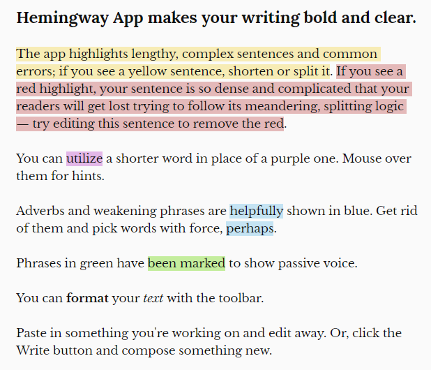
Yellow and red where your sentences become too long
Site speed is a critical Google ranking factor, so having a slow page will negatively affect your SEO. There are many different reasons for a slow-loading site- from JavaScript issues to unclean code to bad hosting. When a visitor clicks on a link, they expect it to load in a second. If your page doesn’t load in the time a user expects it to, it will negatively impact their user experience and they may even abandon your site altogether. It’s important to test your site for issues and to optimize your site performance.
A few tools that you can use to assess your site’s loading speed are:
A cluttered site design is overwhelming. There may be too much content or text, it may not seem organized in a logical way, or there may be too much visual noise. According to EyeQuant, clutter leads to increased cognitive load, which results in more visual confusion and frustration. Eliminating unnecessary content is an effective way to lessen the cognitive load, and also helps to increase focus on the important elements of the page and improve user experience.
If your site is too cluttered and confusing, we suggest researching how you want users to navigate the funnel of your site and optimize your site to lead them through that path. You should plan around the conversions you hope to get out of each visit and strategize a clear linking strategy.
When designing your site, “less is more” is the golden rule. Use simple design and negative space in order to attract the reader to the most important elements on your page. You may also want to cut down on the number of pages on your site to make it easier for users to navigate.
A site visitor needs to know what you want them to do when they’re on your page. Your call-to-action (CTA) should give the user direction and align with your site’s goals. If a conversion for your site is to get a visitor to sign up for a newsletter, your CTA should clearly direct the user to “Sign Up” for the newsletter.
According to Crazy Egg, your CTA is the “moment of truth that differentiates a conversion from a bounce”. This means that your CTA is extremely important and should be optimized in order to convert as many users as possible.
Here are a few tips for creating your CTA:
This CTA from our site uses contrasting colors that stand out from the rest of the page. The copy is simple and direct- letting the user know that we want to get in touch.
Most people rely on a smartphone as their sole computer. There are almost 7 billion people with smartphones and only 1.3 billion who own a desktop computer.
Mobile traffic continues to increase every year. More than half of searches are conducted on a mobile device, and if those users don’t like what they see, they’ll leave right away with the swipe of a finger. Mobile visitors only tend to stay on a page for half of the time as desktop users, so it is imperative that you optimize your site for mobile users.
To render your site for a user on any device, you should optimize your site with a responsive site design. Responsive design means that your site will fit a screen of any size, perform well, and present content clearly in any situation. Responsive site design will arrange content and images on the screen based on the size of the device screen. If a user has to “pinch and zoom” on your mobile site- then your site is not mobile-friendly.
You should make sure to regularly perform mobile testing to make sure that your site is responsive on all devices.
Mobile users are usually looking for answers fast, so if a site doesn’t give them the information they want right away, they’ll go somewhere else.
If your site is underperforming due to one or more of these issues - we suggest you tackle it right away. If you aren’t SEO-savvy, do what you do best and hire out the rest.
Let the professionals help you out.