
Subscribe to our newsletter!
We don't spam. You will only receive relevant and important tips for you and your business.
Unsubscribe anytime.
In our mobile-crazed culture, people are always on their phones. On average, US adults spend 2 hours and 55 minutes on their smartphones every day.
Of the 4.66 billion internet users worldwide, 3.5 billion are smartphone users. That’s 75 percent of all internet users.

Mobile-first design is not responsive design, though they often get mistaken for the same thing.
Responsive design starts on the desktop at the maximum resolution and then scales down to the smallest screen. Even though the content and layout contract to fit smartphones, the navigation, content and download speeds are geared more for a traditional website.
“Mobile first” shifts the paradigm of a website user experience. As the name suggests, instead of users’ viewing desktop versions of websites on their mobile device, users are now viewing sites that have been created specifically for their mobile screen.
Mobile design employs less screen space. In fact, it removes 80% of screen real estate. Users have a harder time reading in-depth content on a small screen and without a keyboard, their ability to type is hindered.
This forces designers to focus on core content and functionality. Text must be easier to read and navigate. Photos and maps should be easily accessible, and all content should adjust to display properly on the device.
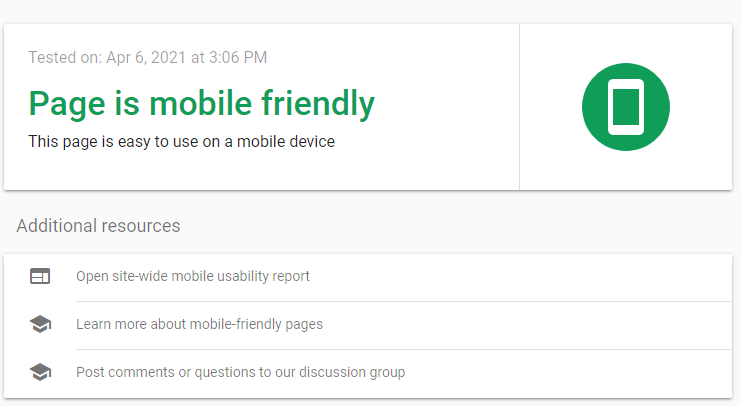
A website that is optimized for mobile ensures that mobile visitors have a quality experience optimized for their mobile device.

If your website isn’t set up to accommodate this, you’ll be in trouble. Optimizing your mobile SEO will help your site gain more traffic. More visitors to your website means more opportunities to convert users.
Mobile-friendly websites are intuitive, easy to navigate, and adaptable to smaller screens. Users don’t have to scroll around to find buttons, pinch the screen to read text, or wait for the site to load. This provides a positive user experience and will ultimately help increase a website’s ranking in the SERPs.
Likewise, the attention span of the average internet user is pretty short. They won’t tolerate a slow-loading website or one that is difficult to navigate. If your site doesn’t provide a positive user experience, users won’t stick around. You could have the most attractive website, but you stand to lose a lot of visitors if it isn’t mobile-friendly.
Making your website as mobile-friendly as possible not only gives you the advantage of a better user experience, but it helps with search rankings as well.
Google uses a mobile-first index, which means it uses the mobile content of a web page to determine its search engine ranking. So, if you don’t optimize your website for mobile SEO, you risk having poorly ranked content.
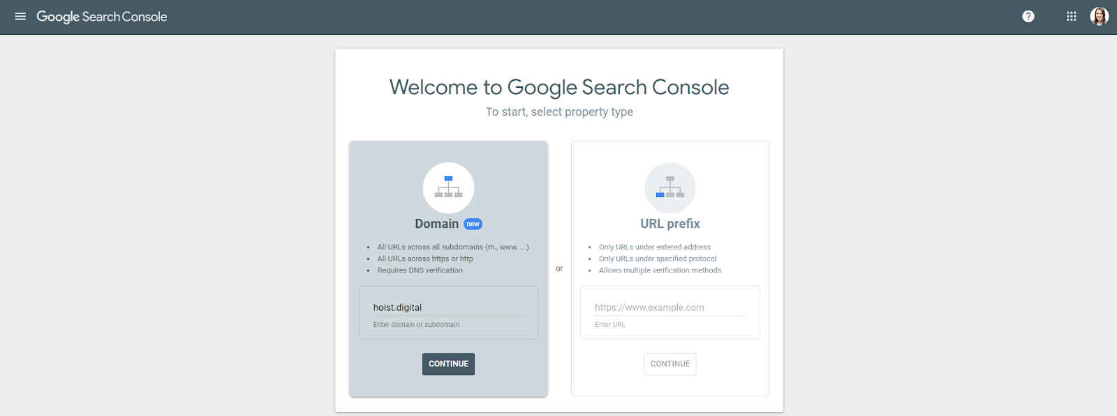
It’s also a good idea to check whether Google can successfully crawl your site. If it can’t, your content won’t appear in the SERPs.
Use the URL Inspection tool in Google Search Console to request a crawl of individual URLs. Note that if you have large numbers of URLs, you should submit a sitemap instead.
To submit a URL to the index:
A mobile-friendly website is a must for local businesses. People often use their phones to find cafes, home service providers, and other local establishments. If your website isn’t mobile-friendly, you risk losing a significant amount of potential customers.
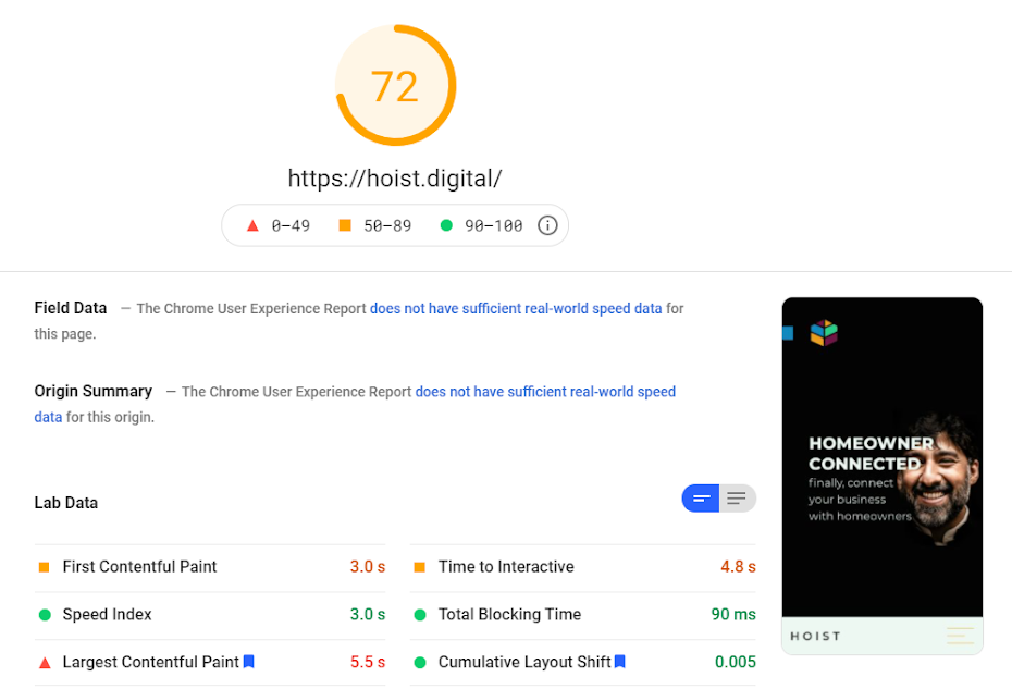
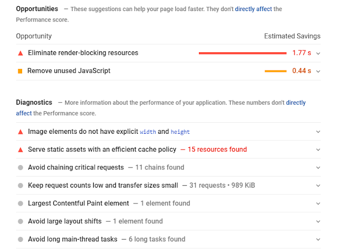
A mobile website that loads slowly is likely to lose visitors. In the United States, 74% of mobile users would abandon sites that don’t load within five seconds.
Not only does a slow site deter users from your site, but it also negatively affects your Google ranking.
Titles and meta descriptions are HTML code that tell both Google and searchers what a page is about.
To write the best page titles and meta descriptions, you must make them unique, make sure they’re the right length, use accurate keywords, and write for the user.
If your title is too long, search engines may cut it off by adding an ellipsis, which could end up omitting important words. Keep the length between 430 and 920 pixels, which is about 70 to 155 characters, respectively. Some characters naturally take up more space. For example, an uppercase "W" is wider than a lowercase character like "i" or "t".
While this works well for most search engines and devices, there is no guarantee that search engines will display your entire meta description. In the end, that’s up to the search engines. To make sure that users know exactly what your page offers, place the most important part of your titles and descriptions at the beginning.
UX expert and researcher Steven Hoober performed an in-depth study to figure out how people hold and interact with their mobile device. He discovered that there were three main types of handholds; the one-handed grip, which was most popular; the cradle; and the two-handed BlackBerry-prayer posture.

While the grips differ, Hoober found that thumbs drive 75 percent of all phone interactions.
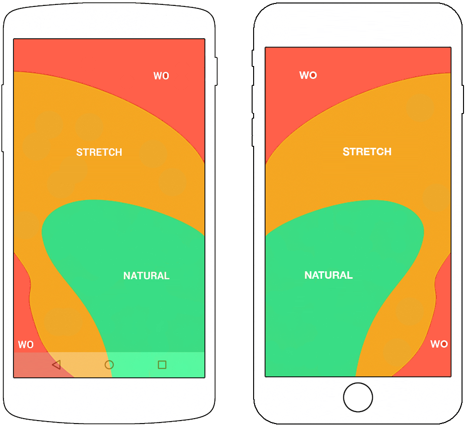
For lefties, the thumb zone flips from left to right. Since optimizing for right-handed users hurts the experience for lefties, you should place core features in the middle of the screen where the two thumb zones overlap.
When placing elements on your website, keep in mind that most users navigate mobile sites with their thumbs. It can be incredibly frustrating for users trying to tap on a link that’s too small.
You can fix this problem by ensuring elements are large enough to be tapped on with a thumb. All you need to do is leave some space between the interactive elements.
The truth is, people love simplicity. It reduces anxiety, improves clarity, and makes us happier.
This applies to web design as well. Less really is more. Keep the website elements you truly need and ditch the rest. Ask yourself if each element is really necessary and eliminate those that aren’t. This will reduce friction and improve the user experience.
Here are six more website simplification tips:
Make it a habit to regularly scan your site for mobile SEO-related issues. Then it’s only a matter of maintaining your site’s mobile-friendliness at top level.
Make sure that you’re constantly testing and updating your website to make sure that it’s optimized to perform on all different browsers and devices. Currently, there are at least nine different operating systems in use on mobile devices and dozens of new phones are released every year. If you want to stay ahead of the curve, you need to test your site across platforms regularly.
Using the mobile optimization strategies listed here should ensure your visitors have a smooth, comfortable experience without any hiccups along the way. In turn, they’re more likely to explore your website for longer and ultimately convert.
Is your website optimized for mobile first?