
Subscribe to our newsletter!
We don't spam. You will only receive relevant and important tips for you and your business.
Unsubscribe anytime.
By Ryan Boog
Lately I’ve been reading about landing pages in a marketing context- how to create them, what to include, amazing examples, terrible examples, so on and so forth. What I’ve concluded is that:
Although a good landing page has to fit certain basic principles and include specific elements, there’s not a specific one-size-fits-all template that you MUST follow. You have to know your audience and cater to them, and;
Not everyone has the patience to test and perfect landing pages until they perform.

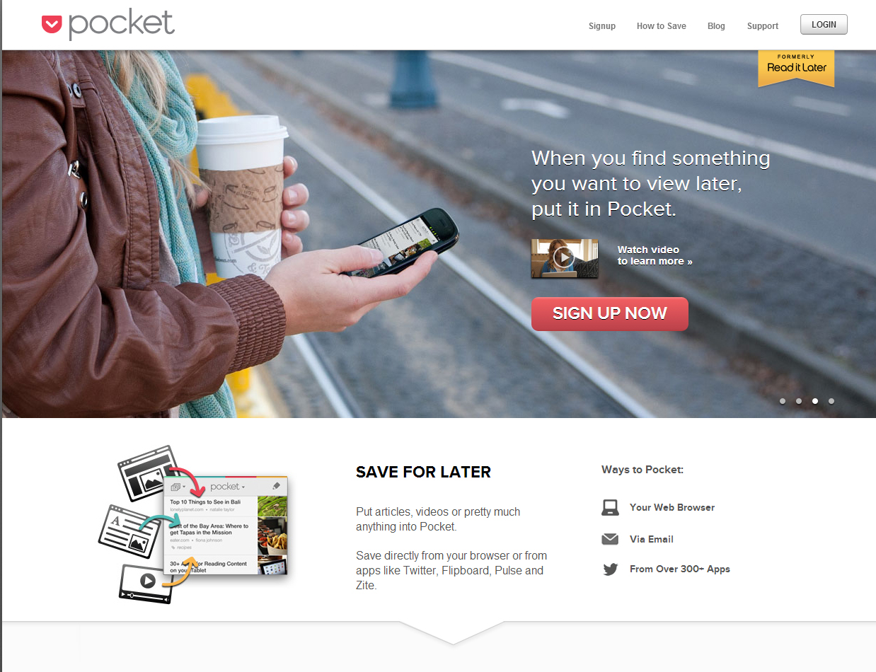
Although you can technically say that every page on your website is a landing page, not every page is optimized to be a landing page. In the sense that we’re talking about, a landing page is created specifically to either capture information from the visitor, get them to sign up for something, or get them to buy. Rather than welcoming visitors or simply looking pretty, a landing page grabs you and propels you to fill out a form with your personal information, usually offering a free resource or opportunity to the visitor in return.
It’s not the party host who opens the door and says, “Come on in and stay awhile!” No - it’s the friend who answers the door, grabs you, pulls you by your arm, and says, “Try this out! See what you think! Taste! Read! Look! Sign up! Get this! Consider this!”
Landing pages offer something - and in order to get it, visitors typically have to give up personal information.
We’re all slightly suspicious of any website that asks us for our personal information, and even more suspicious of pages that are intended to make a sale with us. That’s why your landing page can flop so easily. People grow tired of landing pages fast, and an annoying one will quickly turn off visitors.
How convincing is your landing page? If a person doesn’t trust you, isn’t sure what you offer is valuable, or isn’t interested, they won’t fill out the form. Which (darn it) is the entire point of the page! So the solution is to give people a compelling reason to fill out the form.
Most of the time, a landing page will promise something in return for your information. On our website, we have landing pages for each of our premium content offers. Ultimately we want to capture a person’s information, but we offer them something of value in return.
Don't get me wrong - landing pages of all varieties succeed! There is no recipe for success. BUT, generally, landing pages that work all share these characteristics.
One goal. For most sites, it’s going to be to get the person to “submit” their personal information.
One link. You want to prevent visitors from leaving and not doing what you’re asking them to! Usually, this link is the “submit” button (except you shouldn’t be using the word “submit” - more below)
One form. The form should be above the fold so that the visitor doesn’t miss it. Unbounce recommends encapsulating it so it stands out. How many fields should the form have? It depends on the information you want. Do you need more than a person’s name and email? Marketers disagree - it depends on how much you think people will want your offer, and how much information they’re willing to give up for it. Typically the shorter, the better.
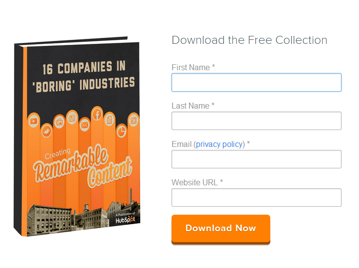
One call to action: The call to action is the button on the form that submits the information - except it should always be customized to the offer.

A compelling, clear headline: The headline has to clearly articulate what you offer. Warning: unless your audience will appreciate wordiness or cleverness, don’t risk confusing your audience with a headline that’s hard to figure out. Be very clear!
Strong copy: The copy should list features or benefits of the offer and be steering the reader to fill out the form. Every word should be helpful and chosen to encourage a conversion. It should be focused on the current offer, not the company as a whole or an issue as a whole. Your copy should also include a clear value proposition. What is it you can offer? How is this offer different from other offers?
Supporting information below the fold: Testimonials, social proof, and other helpful information that could help a person trust you or convince them to fill out the form can be good.
Be clear: we can’t emphasize this enough. Clarity always wins. In this case study, an older, more direct landing page selling Finnish ski vacations outperformed a newly designed landing page. Although it only had a higher conversion rate by 1.4 percent in acquiring contacts, it closed 15 percent of the deals that were initiated through the site, versus the newer site’s scant 2 percent closing of deals. Why? The old one was clearer, less confusing, and more action-oriented. The new page was slightly confusing and less clear on what it actually offered. It turns out that fancy design and wording can detract from the effectiveness of your page.
Go long or go short: some pages do really well and are very simple. Others are super lengthy and tell a story. It depends on what your landing page is trying to do. If you’re just trying to get emails and are offering a free resource, chances are good that short will do. But if you’re trying to get people to sign up or pay for something, you may need to storytell for longer.
Hide links to other places on your website: no navigational bars allowed! You want to get people to focus on the offer you’re making. You want them to act. So don’t let them escape!
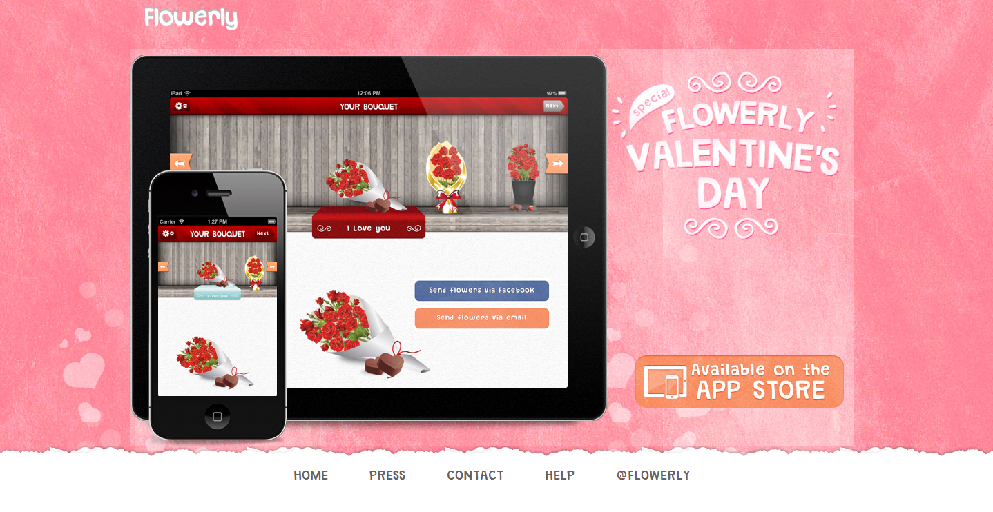
This landing page for Flowerly is lovely, with the orange "Available on the App Store" button serving as the call-to-action. But they didn't remove their links from the bottom, so users could get distracted and go elsewhere without downloading the app.
Test what works for your audience: nearly every marketer recommends performing A/B testing on your landing pages. The only way you’ll know what works for your audience is to test it. In this case study, Conversion Rate Experts tell how testing and research paid off in huge ways for Moz - specifically, in a $1 million increase in sales of Moz’s Pro Membership! How? They lengthened the page to really tell a story, modified the headline to spark curiosity, added information about important key aspects of the service customers loved, explained in more detail what visitors would get by signing up, and provided video. Booyah!
Although some things will change depending on the audience and purpose of the page, the timeless principles that should provide a starting point for landing page creation are…
To see more examples of landing pages that Hoist has created (and to get some cool free content), check out our content page.
Let's Chat About Landing Pages