A blunt, evidence-led review of sproutmation.com — measured, not guessed. Real Google Lighthouse runs, captured screenshots, and the research-first CRO heuristics Peep Laja’s CXL team uses to find why good traffic doesn’t convert. The surprise: this is a genuinely well-built site with a clear message and strong content. The problem isn’t craft. It’s that the page asks a facility buyer to do too many things — and the one it pushes hardest sends them to create an account and set a password before they can even see a price. Every claim below links to its source.
Source: live Google Lighthouse (mobile), homepage, 20 July 2026. The build is genuinely strong — SEO 100, near-zero layout shift (CLS 0), only 20 ms of blocking time. The one real drag: the page ships roughly 14 MB over 53 requests, pushing mobile LCP to 3.6 s — past Google’s 2.5 s “good” line. But the leak that actually costs leads isn’t milliseconds. It’s the front door.
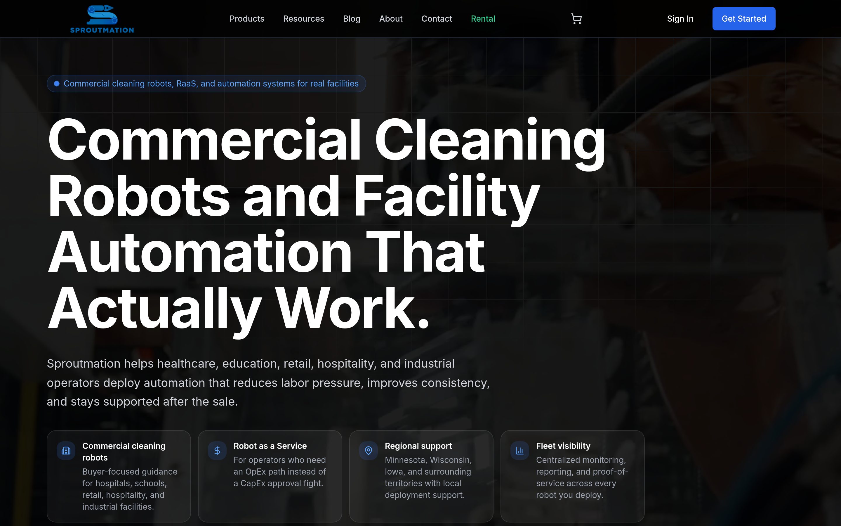
Sproutmation has done the hard part well. The value proposition is clear in one line — “Commercial Cleaning Robots and Facility Automation That Actually Work” — the content is genuinely buyer-aware (ROI tools, cost guides, territory pages, an OpEx path), and the site is technically solid. This is not a demolition.
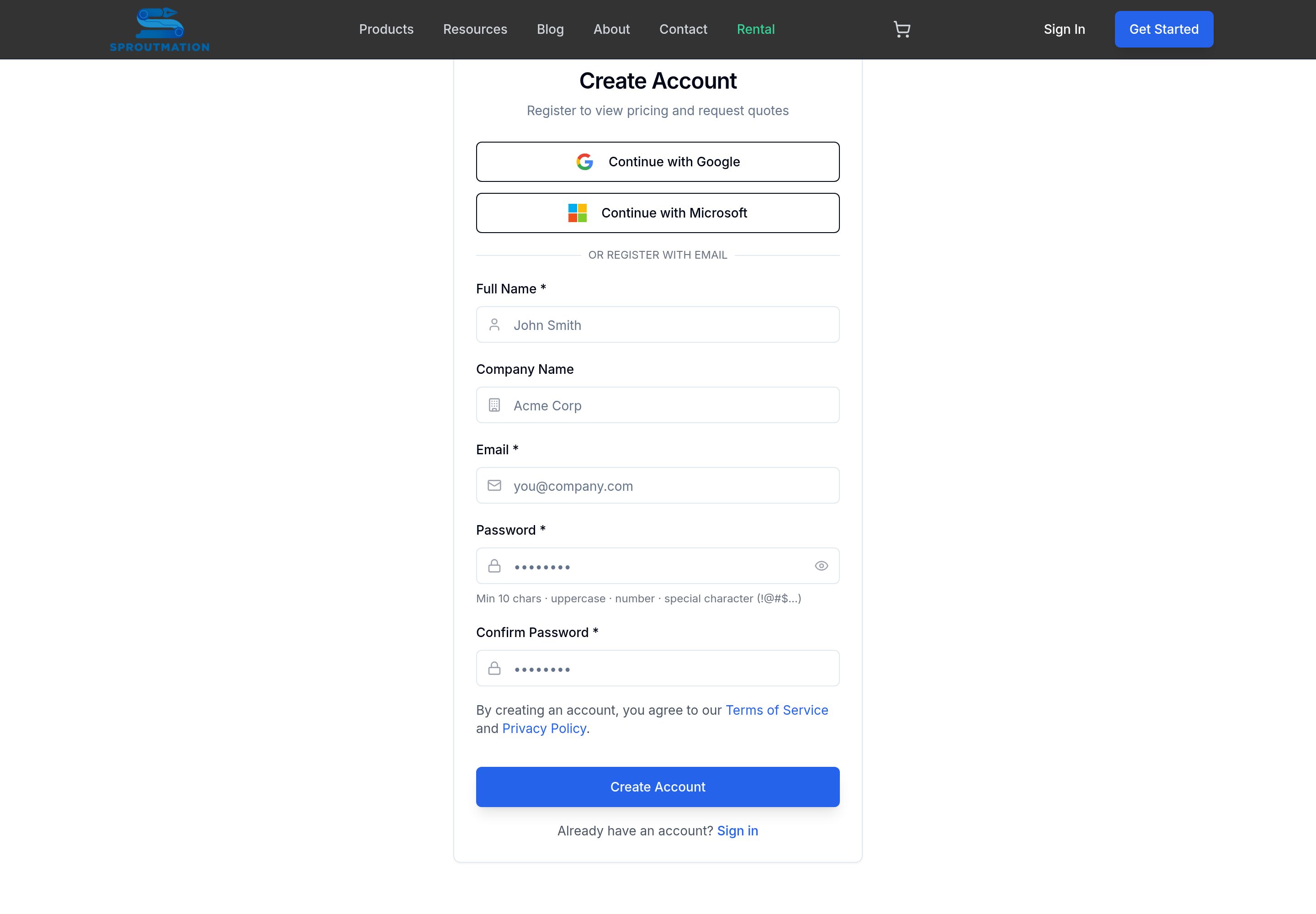
But a well-built site still has to do one job: turn a facility operator who’s interested into a conversation. Right now the page offers that visitor eight or more competing actions, and the one given the most visual weight — the blue “Get Started” button in the header — sends them to a “Create Account” screen that says “Register to view pricing.” A B2B buyer researching cleaning robots will not set a 10-character password to find out what one costs. That’s the moment the lead quietly leaves.
The findings opposite are ranked by how directly they cost you leads. None require a rebuild or a new platform. They require the site to make it obvious and effortless to take the one step that matters: start a conversation.
We didn’t rely on opinion. The audit triangulates three lenses, and every external claim is linked so you can check our work.
1. Research-first CRO. We walked every screen through Peep Laja’s ResearchXL framework and the Conversion Sequence Heuristic. Laja’s core law: “clarity trumps persuasion,” and the value proposition — and the next step — must land in ~5 seconds.
2. Attention ratio & friction. Conversion-centered design says a page should have one primary goal, and every extra field or gate is friction that visibly costs conversions. We also read the site against how B2B buyers actually buy — mostly self-serve, sales last.
3. First-party measurement. Real Google Lighthouse runs and captured screenshots — not guesses — so the technical verdict is earned, and the credit we give the build is real.
C = 4m + 3v + 2(i − f) − 2a
m = motivation · v = value proposition · i = incentive · f = friction · a = anxiety
Source: MECLABS conversion sequence heuristic
Hold this in mind. Sproutmation’s value proposition (v) is strong — that term is working. The damage is on the right: a “register to see pricing” gate is pure friction (f), and a password requirement on a first touch adds anxiety (a). Those are the terms bleeding conversions here.
Give credit where it’s due: the hero passes the 5-second test on clarity. “Commercial Cleaning Robots and Facility Automation That Actually Work” is a real value proposition, and the sub-head names the industries and the payoff. A first impression forms in about 50 milliseconds (NN/g), and this one makes a good one.
The gap is the next move. Clarity of message with no clarity of action is a dead end. Directly under the hero sit three co-equal buttons — “Request a Demo,” “Get a Free Facility Assessment,” “Explore Robot as a Service” — while the header pushes a fourth, “Get Started.” Four doors, all the same size, is the same as no door at all.
Sources: NN/g — 50ms first impression · CXL — the 5-second test · CXL — clarity trumps persuasion
The single most emphasized action on the site — the blue button pinned to the top-right of every page — is “Get Started.” It leads to a “Create Account” screen whose own sub-head reads: “Register to view pricing and request quotes.” To get a number, a facility manager must supply a name, company, email, and a password of at least 10 characters with an uppercase letter, a number and a special character — or hand over their Google or Microsoft login.
That is a lot of friction and anxiety at the exact moment a buyer is deciding whether you’re worth the effort. In e-commerce, forced account creation is one of the top reasons people abandon — roughly 1 in 4 walk away rather than make an account (Baymard). For a considered B2B purchase it’s worse: the visitor isn’t mid-checkout, they’re still researching — and you’ve asked them to sign up before you’ve earned it.
“Get Started” is also the wrong verb. It’s SaaS-trial language. Nobody “gets started” on a fleet of commercial cleaning robots by making an account — they get started by talking to someone who can scope their facility.
Sources: Baymard — forced account creation & abandonment · NN/g — forcing registration · CXL — form friction
A landing page should have a high attention ratio — ideally one primary action per screen. On the Sproutmation homepage, we counted the distinct things a visitor is invited to do before they’ve scrolled halfway:
Captured from sproutmation.com homepage & header, 20 July 2026. Several are variations of “talk to us” wearing different labels.
The instinct here is generous — meet every buyer where they are. But the effect is choice overload. The right structure keeps that helpful content while funneling every path toward the same, single conversion event. GetUplift found that simply removing one competing secondary CTA lifted calls +18% and form completions +45% — and that’s from removing one. There are nine spares here.
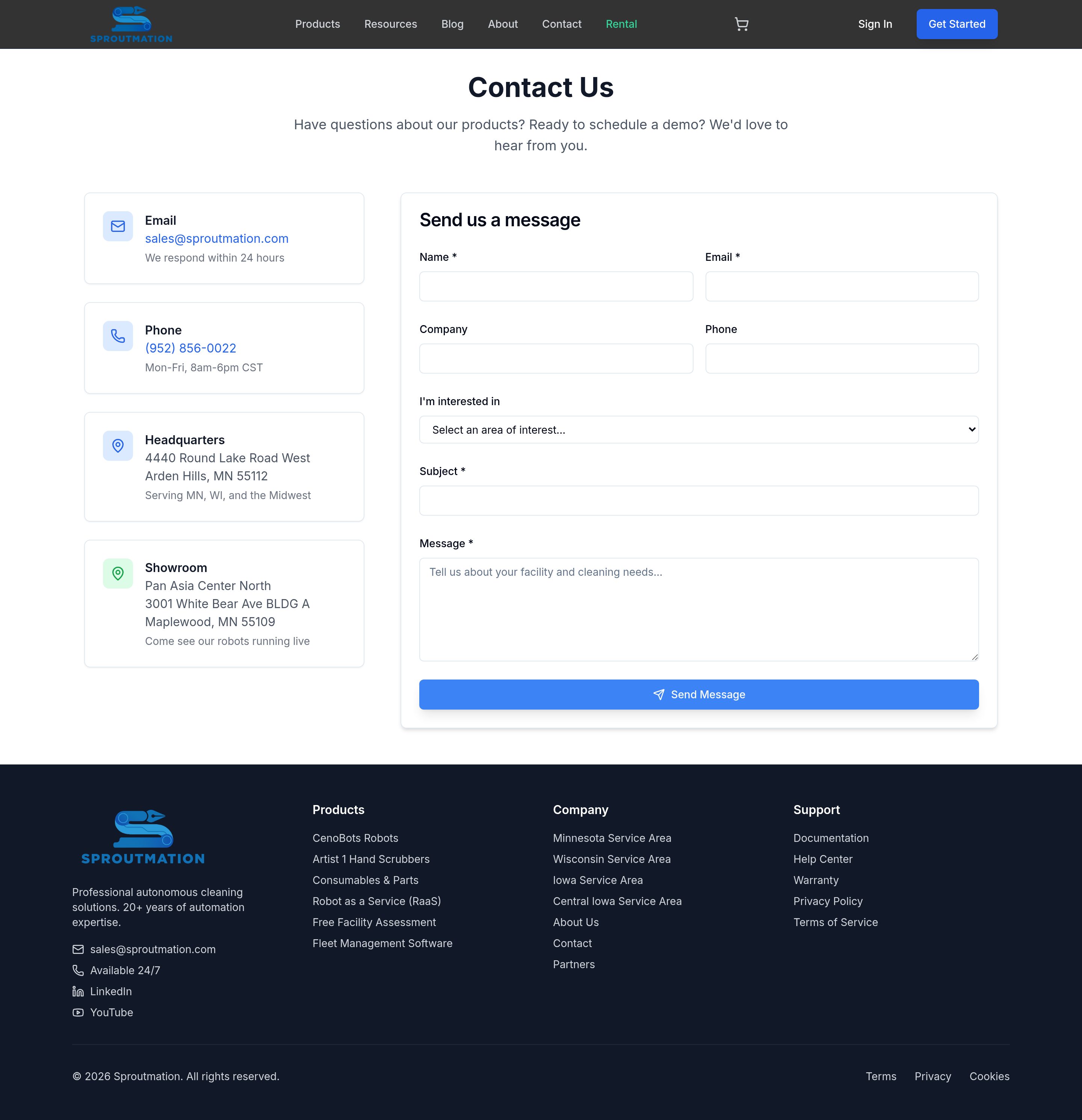
Here’s the twist — the Contact page itself is fine. A tap-to-call number, a 24-hour response promise, an email, a headquarters, and a showroom that invites you to “come see our robots running live.” Those are real trust signals. Credit given.
The problem is that this is a destination you have to go looking for. On every other page the phone number is invisible — there’s no number and no persistent “book” button in the header, just a small “Contact” tab competing with “Sign In” and “Get Started.” A buyer who’s ready to talk has to hunt for the way to do it, while the loud button hurries them toward a password wall.
And once they arrive, the form asks for a required Subject line and a free-text Message (“Tell us about your facility and cleaning needs…”). Composition is friction: the more a form makes someone think and type, the fewer finish it (CXL). For a first touch, a busy operations manager wants to book a slot, not draft a paragraph.
Sources: Unbounce — attention ratio & primary CTA · CXL — form design & friction · NN/g — make actions obvious
The moment marketing sends real traffic — paid search, LinkedIn, email, a trade-show QR code — the conversion path stops being a detail and becomes the whole game. Every problem above gets multiplied by the click volume you’re paying for.
Three things need to be true before a dollar of spend pays off:
Message match. A click on “autonomous floor scrubber for hospitals” should land on a page about exactly that, with one action — not a general homepage with ten. Google explicitly rewards a strong landing-page experience with lower cost-per-click, so message-matched pages don’t just convert better — they cost less.
One conversion event. With ten different CTAs, there’s no single thing to optimize toward and no clean signal to feed back to the ad platforms. One primary action per page gives marketing something to measure and improve.
An open door. Most of a B2B purchase now happens before a buyer ever contacts sales — Gartner finds buyers spend only about 17% of the journey with suppliers, and far less with any single one (Gartner). Gating pricing behind registration blocks buyers during the exact stretch when they want to self-educate — so many never reach the stage where they’d talk to you.
Sources: Gartner — the B2B buying journey · Google — landing-page experience · Unbounce — message match


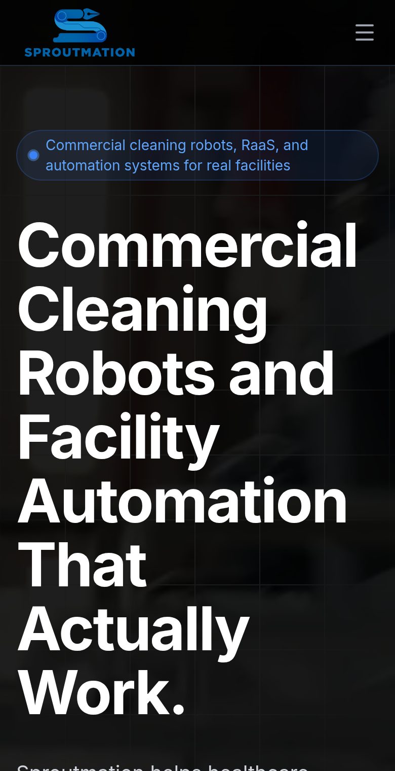
An operations lead often first checks a vendor from a phone, on the floor. Here the mobile header is a logo and a hamburger — no phone number, no visible action. The headline eats the whole first screen; scroll past it and you meet the same three competing buttons stacked vertically (Demo / Assessment / Explore RaaS). There’s still no tap-to-call anywhere.
People barely read on the web — 79% scan rather than read word-for-word (NN/g) — so on mobile the one thing to do next has to be instant and impossible to miss. And the weight isn’t helping: at ~14 MB the page takes 3.6 s to render its main content on mobile, past the point where 53% of visitors abandon.
| Dimension | Grade | The one-line verdict | |
|---|---|---|---|
| Clarity / value proposition | A− | Strong 5-second message — a real asset. | |
| Content & buyer journey | B+ | ROI tools, cost guides, territory pages — thoughtful. | |
| Primary action / conversion | D | 10 competing CTAs; the loudest is “register.” | |
| Friction to buy (pricing gate) | F | Pricing locked behind account creation. | |
| Ease of contact | C | Good contact page — but no phone in the header. | |
| Marketing / landing-page readiness | C− | No message match, no single conversion event. | |
| Mobile experience | C− | No tap-to-call; action hidden in the hamburger. | |
| Performance (mobile) | C+ | 88 score, but 14 MB pushes LCP to 3.6s. | |
| Accessibility | A− | Lighthouse 91 — solid foundation. | |
| SEO | A | Score 100 — a genuine asset to protect. |
Grades are heuristic (research-first CRO lenses + first-party measurement), not a single automated number. Message, content, accessibility and SEO are real strengths — the work is converting the traffic those strengths attract.
Bottom line: this isn’t a rebuild — it’s a conversion & go-to-market fix on a foundation that’s already good. Keep the platform, the content, the SEO, the clear message. Change the front door and the path to the one action that matters. Here’s the order we’d do it in.
Stop the leak on the current site immediately.
A conversion-first layer, measured against the same lenses used here.
The one thing to take away. You don’t need a new site — you need a front door. Give buyers one obvious way in and an easy way to reach a human, and the good traffic your message and SEO already earn will finally turn into conversations. That’s the whole gap between a site that looks the part and one that fills the pipeline.
First-party measurements — the Lighthouse run and every screenshot — were captured by Hoist on 20 July 2026. External references below back each cited statistic; click to verify.