Audit
Subject: bilingualchildcare.com
Conversion & UX Teardown · Prepared by Hoist

The site is working against the parents it’s trying to win.

A blunt, evidence-led review of bilingualchildcare.com — measured, not guessed. Real Lighthouse runs, pixel-sampled contrast math, and the heuristics Peep Laja’s CXL team uses to find why visitors don’t convert. Every claim below links to its source.

D− Strong bones (real photos, real reviews, good SEO) buried under a design that fails the first five seconds.
0
Performance
0
Accessibility
0
Best Practices
0
SEO
0s
LARGEST CONTENTFUL PAINT
(mobile · target ≤2.5s)

Source: live Google Lighthouse run (mobile, slow-4G emulation) against the homepage on 2 June 2026. Page ships 1,511 KB over 68 requests. CLS is a clean 0 — credit where it’s due.

01

The brutal version

Bilingual Child Care has the hardest part already solved: a genuinely differentiated offer (Spanish-immersion early learning, two Twin Cities locations), real classroom photography, and a “Minnesota’s Best” award. The website actively hides all of it.

This isn’t a matter of taste. A prospective parent decides whether a site looks credible in about 50 milliseconds — before a single word is read — and 46.1% of people judge a company’s credibility partly on visual design (CXL). Right now that snap judgement is working against the business.

The seven problems below are ranked by how directly they cost enrollments. None of them require throwing away the brand or leaving WordPress. They do require a new template.

Top findings, by severity
  1. Critical No clear value proposition or single primary action in the first screen
  2. Critical Navigation is four color blocks most visitors won’t recognise as clickable
  3. Critical 12.7s mobile LCP — roughly half of phone visitors leave before it loads
  4. High color roles inverted: CTA-amber used as body text; low-contrast pairings fail WCAG
  5. High No phone number in the header — the lowest-friction way an anxious parent converts
  6. High Three display fonts, ~130-character line length, almost no whitespace
  7. Medium Stale trust signals: hard-coded “© 2025” and an unrecognisable favicon
02

How we judged it

We didn’t rely on opinion. The audit triangulates three lenses, and every external claim is linked so you can check our work.

1. Peep Laja’s CXL heuristics. We walked every screen through the entry point of the ResearchXL framework — scoring Clarity, Relevance, Friction and Distraction. Laja’s core law: “clarity trumps persuasion,” and a value proposition must be understood in ~5 seconds.

2. Modern UX & typography research — Nielsen Norman Group, Baymard Institute, the WCAG guidelines and Butterick’s Practical Typography.

3. First-party measurement. Real Google Lighthouse runs, and contrast ratios computed from actual pixels sampled out of the live screenshots — not eyeballed.

The CXL conversion formula

Conversion ∝ motivation + clarity + (incentive − friction) − anxiety

Source: CXL · Conversion Optimization

Hold that formula in mind as you read. Almost every problem below is the site adding friction or anxiety, or subtracting clarity — the three terms you most want working in your favor.

03

The first five seconds

bilingualchildcare.com
Bilingual Child Care homepage, full length, desktop
The actual homepage (scroll it). Before any copy is read, the eye meets a beige bar, a rainbow wheel, four saturated blocks, an award badge, three navy pills, and a blue hero — six competing things, no single focal point.
Critical · Clarity

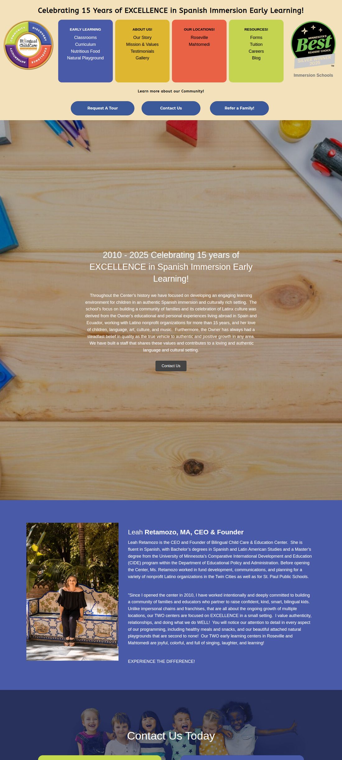
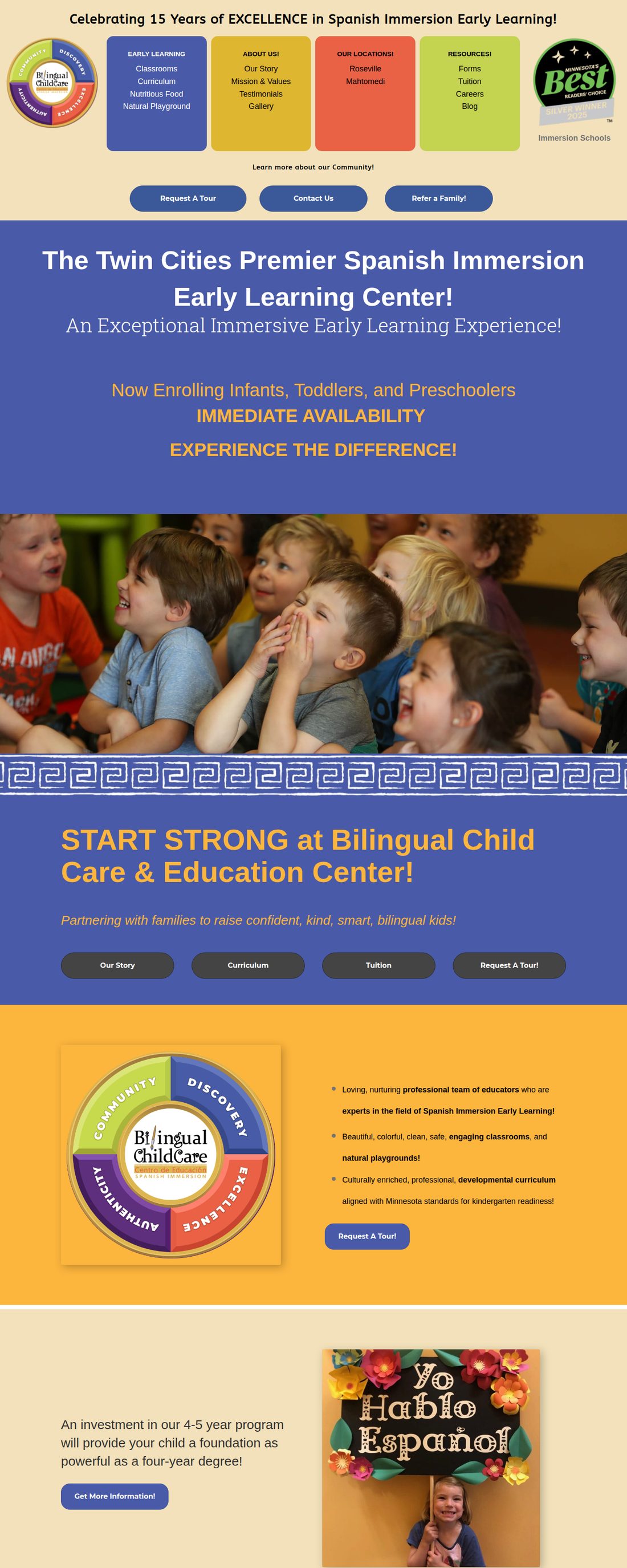
A visitor can’t answer “what is this and why choose it” in five seconds.

The hero spends its most valuable real estate on decoration instead of a claim. The differentiator that should be impossible to miss — true Spanish immersion, ages served, two locations, what it does for your child — is never stated plainly above the fold.

Users form a visual first impression in ~50ms, and that impression sets a credibility “halo” for everything after it. A low-complexity, conventional-looking design wins that judgement; a busy, unfamiliar one loses it.

46.1%
of people assess a site’s credibility partly on visual design — layout, typography, color.

Sources: CXL — First impressions · CXL — Value proposition & the 5-second test · NN/g — be specific, not generic

Fix: One headline that names the offer and the outcome, one supporting line, one primary button (“Schedule a tour”), one warm photo. Everything else moves down.
05

color roles are inverted — and the math proves it

homepage hero
Amber text on the blue hero of the homepage
The CTA-amber is used as body text on the blue hero (“Now Enrolling… IMMEDIATE AVAILABILITY”). An accent color reserved for one action is instead spread across paragraphs — so nothing reads as the action.
High · Clarity & Accessibility

When everything is loud, the button can’t shout.

Good hierarchy comes from contrast in value and saturation, not from more colors — “if everything is contrasted, nothing stands out” (NN/g). The page saturates every band, so the dark-navy CTA pills are actually quieter than their surroundings — the accent rule run backwards. The discipline to aim for is the 60-30-10 rule: a dominant neutral, a secondary, and a single 10% accent saved for the primary action.

And these aren’t just stylistic gripes. We sampled the real pixels and ran the WCAG contrast maths:

Now Enrolling · amber on blue
3.57:1Fails AA
Link blue on pink
2.65:1Fails AA
Link blue on white
3.63:1Passes AA (large)
White on hero blue
6.84:1Passes AA

Ratios computed with the WCAG formula from the site’s own color values — the amber/blue hero pair sampled directly from the live page. WCAG AA needs 4.5:1 for normal text, 3:1 for large text (W3C 1.4.3). Low-contrast text is the web’s most common accessibility failure (WebAIM Million).

Fix: Pick one accent for actions and keep text near-black or white. Test every text/background pair against 4.5:1 before it ships.
06

There is almost no room to breathe

High · Cognitive load

Whitespace isn’t empty — it’s what makes the rest legible.

Full-bleed saturated backgrounds run edge to edge with content packed against them. NN/g calls whitespace the negative space that “strengthens figure-ground separation” and lets elements be seen; CXL calls adding whitespace the “golden rule of simplicity.” The repeating wave divider and stacked color bands do the opposite — they raise the mental effort needed to process every screen, and high cognitive load measurably costs conversions.

This very page is the counter-example: one typeface, a calm neutral background, a capped reading column, and space around each idea. It isn’t harder to build — it’s a decision.

Sources: NN/g — Whitespace · NN/g — Visual hierarchy

/our-story-spanish-immersion-day-care-prek-mn/
Our Story page showing white text over a busy photo and dense color bands
On “Our Story,” white text is laid directly over a busy wood-grain photo — the headline and paragraph fight the background for legibility, with no panel or overlay to separate them.
07

Typography: three voices, and lines too long to track

/…/our-model-environment-for-early-learning/
Blog article body text running the full width of the page
A real article, unedited. Body text runs the full container — roughly 120–140 characters per line. At the end of each line the eye has to hunt for the start of the next, so readers skip lines or give up.
High · Readability

~130 characters per line is about double the readable limit.

The evidence is unusually unanimous here. Baymard puts the ideal measure at 50–75 characters; Butterick says 45–90; and WCAG 1.4.8 caps blocks at 80. The articles here run past all three. Combine that with three loaded display fonts — Montserrat, Roboto Slab and ABeeZee, plus Font Awesome — and the page asks readers to parse several typographic voices at once.

It matters because people barely read online to begin with: on an average visit users read at most ~28% of the words, and 79% scan rather than read. Over-wide, undifferentiated text means the scanned fraction misses the message.

Sources: Baymard — Line length · Butterick · NN/g — How little users read · NN/g — Scanning

~130
characters per line in articles — vs the 50–75 ideal and the 80-character WCAG ceiling.
3 + 1
display font families (Montserrat, Roboto Slab, ABeeZee) plus Font Awesome, all downloaded on the homepage.
≤28%
of words read on an average page visit — so the layout has to earn every scan.
Fix: Cap article text at ~65–70ch (≈680px), commit to one type family with two weights, and drop the unused fonts.
08

The trust & conversion leaks

A daycare is one of the highest-trust purchases a parent ever makes. Three quiet details undercut exactly the trust this business needs to earn — and each is a near-zero-cost fix.

High

No phone in the header

A visible, tappable number is the lowest-friction path for an anxious parent with one quick question about openings or ratios. It isn’t in the header. Up-front contact details are a primary trust signal; hiding them creates hesitation.

Sources: NN/g — Trustworthy design · CXL — Friction

Medium

Hard-coded “© 2025”

In mid-2026 the footer still reads © 2025 — a static year, not a dynamic one. Small, but it whispers “nobody maintains this,” and 74% of consumers only trust reviews/signals from the last three months.

Source: BrightLocal — Local Consumer Review Survey

Medium

The favicon is a mystery blob

favicon at real browser-tab size → at real tab size favicon enlarged

It’s a hand-drawn pencil with a red squiggle — no “B,” no brand color, no tie to the rainbow-wheel logo. At 16px it’s an unidentifiable smudge in the tab.

Credit where due

The fundamentals that are hardest to fake are present: a clear niche, real photography, named staff bios, an award badge, a working blog, and a clean SEO score of 100. This is a redecoration problem, not a demolition.

09

Speed: the silent enrolment killer

Critical · Performance

A 12.7-second mobile LCP loses roughly half the visitors before they see a thing.

Parents research daycare on their phones. Our Lighthouse run clocked the homepage’s Largest Contentful Paint at 12.7s on mobile — Google’s “good” bar is 2.5s, and anything over 4s is “poor.” Google’s own data: 53% of mobile visitors abandon a page that takes over 3s, and bounce probability climbs 123% as load goes from 1s to 10s.

The cause is page weight, not the network. The site is built on WordPress + Beaver Builder, which ships 18 stylesheets, 25+ scripts (885 KB of JS), three font families and Font Awesome, and 82 “!important” overrides — with 292 KB of JavaScript and 70 KB of CSS never used on the page.

Sources: web.dev — LCP · Google/SOASTA — 53% · Think with Google · Portent

12.7s
mobile LCP (target ≤2.5s)
53%
of mobile users abandon >3s loads
1.5 MB
page weight over 68 requests
362 KB
JS + CSS shipped but unused
Why it’s fixable on WordPress

In a like-for-like benchmark, page builders trail block-based builds on LCP, and a server-level cache alone cut one test page from 5.0s to 0.5s. Better managed hosting (e.g. Hostinger’s LiteSpeed/object cache) reports ~3× faster WordPress responses and 56% lower LCP — before a single redesign.

Sources: WP Rocket benchmark · Hostinger

10

On the phone — where parents actually look

Homepage on a phone, full length
Amber hero text on mobile
High · Mobile

The desktop compromises get worse on a small screen.

The four color blocks stack into a tall wall the visitor must scroll past before reaching the actual pitch and the buttons. The amber-on-blue hero copy (right) is the same 3.57:1 contrast that fails WCAG for normal text — harder still on a sunlit phone. And every extra second of that 12.7s load disproportionately raises the odds a parent leaves first.

Fix: Mobile-first hero — headline, one line of value, a tap-to-call and a “Book a tour” button in the first screen. Navigation behind a labelled menu, not stacked color panels.
11

Heuristic scorecard

DimensionGrade The one-line verdict
Clarity / value propositionFNo 5-second answer to “what & why.”
Navigation & wayfindingD−color blocks don’t read as clickable.
Visual hierarchy & colorDEverything loud; accent role inverted.
Whitespace & layoutDEdge-to-edge, no room to breathe.
Typography & readabilityD~130 cpl, three display fonts.
Accessibility / contrastC−Lighthouse 82, but real pairs fail AA.
Performance (mobile)D12.7s LCP, 1.5 MB, builder bloat.
Trust signalsCGreat assets, undercut by stale details.
Content & SEOB+Real strength — keep and build on it.

Grades are heuristic (CXL ResearchXL lenses + first-party measurement), not a single automated number. SEO and content are genuine assets — the redesign should protect them.

12

The recommendation

Bottom line: this needs a full template redesign, not another round of patches on the Beaver Builder layout. Stay on WordPress, keep the brand and the content — rebuild the shell. Here’s the order we’d do it in.

Now Quick wins — days, not weeks

Stop the bleeding on the current site while the redesign is built.

  • Add a sticky header with a tap-to-call phone number and one “Book a tour” CTA.
  • Make the four color blocks a real, labelled menu (or a normal nav bar).
  • Fix the footer year (dynamic) and design a recognisable favicon from the logo.
  • Cap blog/article text width to ~680px.
  • Recolor failing text pairs to hit 4.5:1; surface Google reviews.
  • Turn on server-level caching / better managed hosting (Hostinger LiteSpeed) to cut LCP.

Next The new template

A conversion-first rebuild, measured against the same lenses used here.

  • A hero that passes the 5-second test: one claim, one outcome, one primary action.
  • Disciplined system — 60-30-10 palette, one type family, a real whitespace scale.
  • Lightweight build (block theme / GenerateBlocks-class) to shed the surplus CSS/JS at the source — target LCP under 2.5s.
  • Trust front-and-centre: reviews, licensing, ratios, staff, tuition clarity, easy tour booking.
  • Mobile-first layouts, WCAG-AA contrast baked in, then validated with a 5-user test — because you are not your user.

One last thing — this isn’t a plea to be beige. Bold color and personality are an asset for a kids’ brand; this site’s problem isn’t that it’s colorful, it’s that the color has no system and no job. Keep the energy. Give it rules, hierarchy, and room — so parents can actually use the site.

13

Sources & method notes

First-party measurements (Lighthouse, contrast) were run by Hoist on 2 June 2026. External references below back every cited statistic — click to verify.