A blunt, evidence-led review of counselingcare.us — measured, not guessed. Real Google Lighthouse runs, captured screenshots, and the heuristics Peep Laja’s CXL team uses to find why visitors don’t convert. The surprise: technically, this site is in good shape. So this isn’t about the code — it’s about the conversation a hurting person has with the page when they land on it. Every claim below links to its source.
Source: live Google Lighthouse (mobile), homepage, 30 June 2026. Here’s the twist — technically, this site is in good shape. Which means the problem isn’t the code. It’s the conversation. Page ships 1,636 KB over 46 requests, CLS a clean 0.023 — all fine. The only real bloat is 370 KB of unused JavaScript.
Counseling Care has the hardest part already solved: a real, caring practice — licensed clinicians, two Twin Cities locations, insurance and sliding-scale, and genuinely high-value care like TMS and Spravato for treatment-resistant depression. The site that represents it loads fast and ranks well. And it says almost nothing to the person in pain who lands on it.
This isn’t the usual “it’s slow and broken” story — the measurements say otherwise. A prospective client forms a first impression in about 50 milliseconds (NN/g) and 46.1% judge a company’s credibility partly on visual design (Stanford/Fogg). Right now that snap judgement meets a decorative stock photo — a plant between two empty chairs — and a wall of cool, institutional blue.
The findings opposite are ranked by how directly they cost appointments. None of them require leaving WordPress, and none require a faster server. They do require the site to start sounding like it understands the person reading it.
We didn’t rely on opinion. The audit triangulates three lenses, and every external claim is linked so you can check our work.
1. Research-first CRO. We walked every screen through Peep Laja’s ResearchXL framework and the Conversion Sequence Heuristic. Laja’s core law: “clarity trumps persuasion,” and a value proposition must land in ~5 seconds.
2. Emotional design & targeting. Talia Wolf’s emotional targeting — sell the feeling, not the features — and Aarron Walter’s emotional-design hierarchy (functional → reliable → usable → pleasurable).
3. First-party measurement & the ad economics. Real Google Lighthouse runs and captured screenshots — not guesses — read against the cost of the paid clicks this page is already buying.
C = 4m + 3v + 2(i − f) − 2a
m = motivation · v = value proposition · i = incentive · f = friction · a = anxiety
Source: MECLABS conversion sequence heuristic
Hold this in mind as you read. The value proposition carries three times the weight of friction or anxiety — and on this site the value proposition, to the person hurting, is close to zero. That’s the term doing the damage.
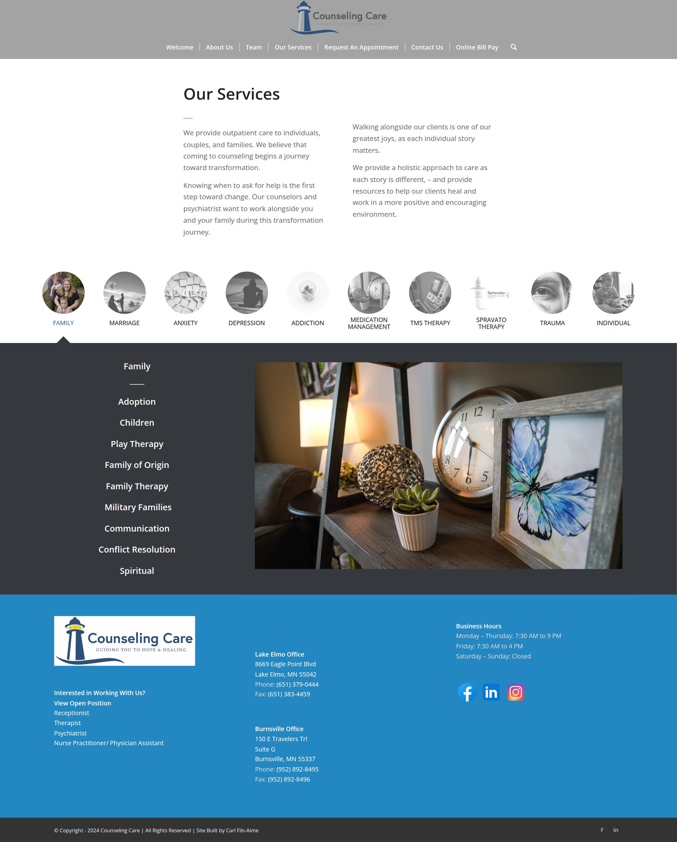
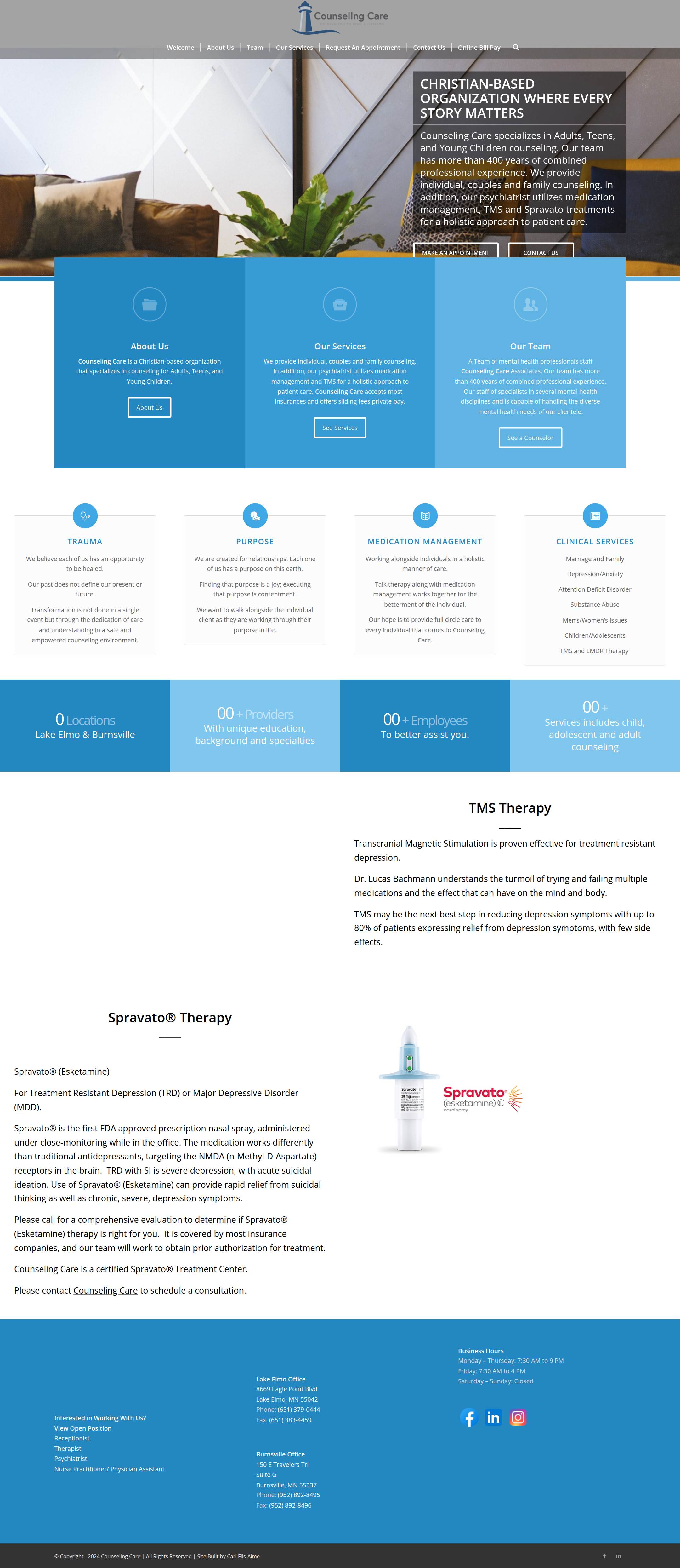
The hero spends its most valuable space on decoration. What a frightened visitor needs to see — who this is for, the relief it offers, and one thing to do next — is never stated. A first impression forms in ~50 ms and rarely changes (NN/g), and clarity beats persuasion every time. The 5-second value-prop test fails here: the image could belong to any furniture catalogue, not a clinic that changes lives.
Sources: NN/g — 50ms first impression · Stanford/Fogg — 46.1% · CXL — the 5-second test
Counseling Care runs paid search — and mental-health is the most expensive corner of healthcare advertising. Mental-health search ads convert at roughly 1.85% and cost about $141 per lead — the highest cost-per-lead in healthcare (LocaliQ). At those prices, a click that lands on a page with no message match and no clear action isn’t neutral — it’s money spent and lost.
Google rewards a strong landing-page experience (one of three components of ad quality), and higher-quality ads typically cost less per click. The lever is message match: the page a click lands on should closely match the ad and keyword that earned it. A search for “anxiety therapist near me” that lands on a generic homepage about the organization breaks that match.
Here’s the one bright spot: speed isn’t the problem. 53% of mobile visitors abandon a page that takes over 3 seconds (Google) — and this site loads in 2.3 s. Credit where it’s due. The leak is message and clarity, not milliseconds.
Sources: LocaliQ — healthcare ad benchmarks · Google — landing-page experience · Unbounce — message match
The body copy is abstract and inward-facing: “We are created for relationships.” “Coming to counseling begins a journey toward transformation.” Beautiful sentiments — but they’re about the practice’s beliefs, not the person’s problem. Nowhere does the site say the thing a frightened visitor is waiting to hear: “Can’t stop the anxiety? Tried medication that didn’t work? You’re in the right place.”
Talia Wolf’s research is blunt: people care about the why and the feeling, not the features. Reframing a headline around the emotional outcome lifted one client +24%; selling trust and safety instead of service lifted a mover +14%. Aarron Walter’s hierarchy says you earn delight only after the foundational, human needs are met — and emotionally connected customers are 52% more valuable than merely satisfied ones (HBR).
Sources: GetUplift — emotional targeting · NN/g — emotional-design hierarchy · HBR — emotional connection
“We are created for relationships… coming to counseling begins a journey toward transformation.”
Verbatim, counselingcare.us — about the practice, not the person
A landing page should have a high attention ratio — ideally one primary action per page. The homepage offers three competing ones in identical weight, plus ghost buttons that barely read as buttons at all, in a monochrome blue where nothing can stand out. GetUplift found that simply removing a secondary CTA produced +18% calls and +45% form completion — clarity of action is one of the highest-leverage changes you can make.
The friction compounds: there’s no phone number in the header. For someone reaching out in a low moment, a visible tap-to-call number is often the lowest-friction path to help — and it’s missing from every page’s most prominent spot.
Sources: GetUplift — removing a secondary CTA · Unbounce — attention ratio · NN/g — visual hierarchy
Reaching out for mental-health care is already hard — stigma drives people to delay or avoid it (APS). Three quiet details add friction at exactly the moment a visitor is most likely to talk themselves out of it. Each is a near-zero-cost fix.
The Contact page says, verbatim: “Please call us with anything that is time sensitive as information from this site is NOT reviewed daily.” To someone reaching out in a low moment, being told the form may sit unread for days is a direct anxiety and abandonment trigger.
Sources: APS — stigma as a barrier · NN/g — trustworthy design
In mid-2026 the footer still reads “© Copyright 2024.” A nav link to /our-services/ 404s with “Nothing Found.” Small things — but trust is judged partly on whether content looks current and maintained.
Source: NN/g — trustworthy design
“10+ Providers · 10+ Employees” sit side by side — redundant, and inward-facing. They describe the practice, not the visitor’s outcome (relief, a fast appointment, being understood).
The fundamentals that are hardest to fake are all here: a real, licensed team, two locations, insurance and sliding-scale options, and high-value care like TMS and Spravato for treatment-resistant depression — plus genuinely strong SEO and page speed. These are real assets to build on. This is a redecoration, not a demolition.


On a phone, the headline reads “CHRISTIAN-BASED ORGANIZATION WHERE EVERY STORY MATTERS” — white, all-caps, set over the busy plant-and-chairs photo. It’s hard to read on a sunlit screen, and it leads with who the practice is rather than what the visitor needs. There’s no tap-to-call, and a long scroll before any reassurance.
People barely read on the web — 79% scan rather than read word-for-word (NN/g). So for an anxious visitor, the reassurance and the way to act both have to be instant and impossible to miss. Right now they’re neither.
| Dimension | Grade | The one-line verdict | |
|---|---|---|---|
| Clarity / value proposition | F | No 5-second answer; the hero is decoration. | |
| Emotional resonance | F | Speaks about the org, not the hurting visitor. | |
| Primary action / conversion | D− | Three equal ghost CTAs, no “book / call now.” | |
| Visual hierarchy & color | D | Monochrome blue; nothing stands out. | |
| Imagery / human warmth | D− | Plants, clocks, drone shots — almost no faces. | |
| Trust signals | C− | Real assets, undercut by “not reviewed daily” & © 2024. | |
| Mobile experience | C | Low-contrast hero, no tap-to-call, long scroll. | |
| Performance (mobile) | A− | LCP 2.3s — a genuine strength. Protect it. | |
| Accessibility | B | Lighthouse 90 — solid foundation. | |
| SEO | A | Score 100 — a real asset to protect. |
Grades are heuristic (research-first CRO lenses + first-party measurement), not a single automated number. Speed, accessibility and SEO are genuine assets — the redesign should protect every one of them.
Bottom line: this isn’t a performance fix — it’s an emotional-resonance and conversion redesign. Keep WordPress if you like it, keep the speed and the SEO, keep the real care this practice delivers. Change the conversation the page has with the person reading it. Here’s the order we’d do it in.
Stop the bleeding on the current site while the redesign is built.
/our-services/ link.A conversion-first rebuild, measured against the same lenses used here.
The one thing to take away. You don’t need a faster server or a new platform. You need a site that sounds like it understands them — so the people already clicking your ads actually reach out. That’s the whole gap between a good practice and a full schedule.
First-party measurements — Lighthouse runs and screenshots — were captured by Hoist on 30 June 2026. External references below back every cited statistic; click to verify.